
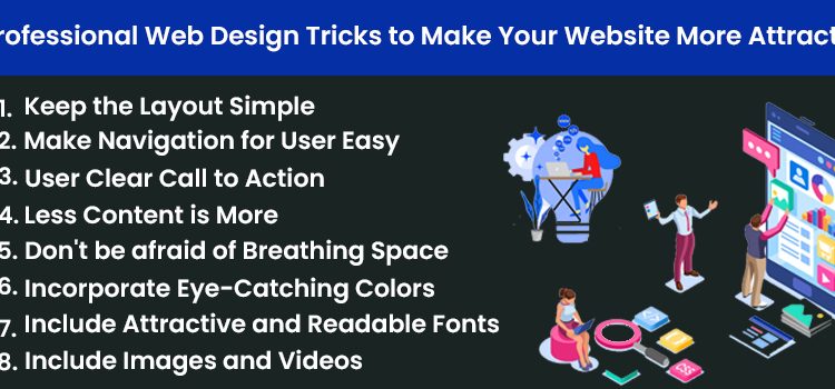
8 Professional Web Design Tricks to Make Your Website More Attractive
What kind of website really insights you? The one that has the best information or the one with the best website design and easy to navigate. Of course, the later one! It is important to understand that the website has an aesthetic appeal to the users and easy to navigate. The users do not trust the website that does not appeal to them. You can get it with simple and easy Burlington Web Design Tricks!
A beautiful and functional website has good customer traffic (both organic and paid). This leads to a better number of leads and, thus, more conversions. Consequently, it leads to more sales and better ROI for the business.
Of course, creativity is necessary, but some basic rules can improve the website design of the website and the users’ experience. Here are some suggestions for you to keep in mind while thinking of attractive website design.
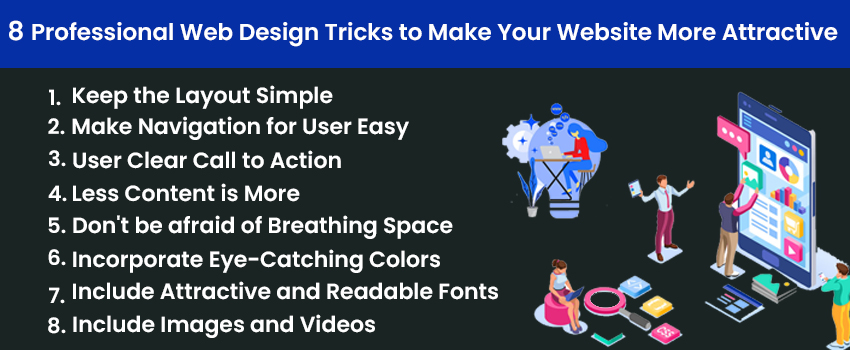
Keep the Layout Simple
It is important to keep the layout simple and classy. Please do not overdo it and end up confusing the consumer. Remember to focus only on the important details of the website. This makes the website easy to navigate, load, and perfect for users. Also, it becomes responsive and compatible with all devices and platforms.
Make Navigation for User Easy
With all the menu and sub-menu sections transparent and cut on the website, the navigation becomes more comfortable. Do not just complicate the headings and other website sections difficult for the users to act on or confuse them. Please keep it simple and of a high-quality standard.
User Clear Call to Action
Call to Action indicates to the user what you want them to do on your website. Whether it is to buy something or learn something or something else, be sure to use simple and straightforward buttons and texts to guide them. Think of a bold and robust call to Action like- Visit, Donate, Buy Now, Submit, etc.
Less Content is More
People do not have time to actually through the content of the website. Thus, it is important to reduce the range and visually to appeal and shift the visitor’s focus to your business’s service or product. Please do not waste time writing content to explain when an image or a short video can do it.
Don’t be afraid of Breathing Space
Yes, you may have some areas in your website that look blank but do not feel tempted to fill the area with a text box or an image. It is important to leave it as it is. You can even plan out the website layout beforehand; be aware that you are about to have breathing space in this area, and be okay with it!
Incorporate Eye-Catching Colors
The most important part of a website is the visual elements- this includes the colour schemes chosen- right from the header to the footer to the pages inside for each button and every little aspect of the website. Choose the right colour palette for your brand or business. Improve the colours to make them appealing to the user while staying connected to the brand.
Include Attractive and Readable Fonts
To make your website attractive, do not end up opting for fonts that only improve the look of the website and are readable to the visitor. Moreover, the font size of the website should be appropriate and visible to the readers.
Include Images and Videos
As we said that the website needs visual elements; this makes the inclusion of videos and images necessary. It helps in increasing the users’ engagement on a specific page. Remember, a landing page with videos witnesses more than 80% of conversions than the other content loaded landing page.
Are you looking to design your website for a better appeal and user experience? Reach out to the professionals- WebFactor.